Monday 30 November 2009

Why Beauty matter..... bbc production

http://www.bbc.co.uk/iplayer/episode/b00p6tsd/b00p6stf/Why_Beauty_Matters/

Philosopher Roger Scruton presents a provocative essay on the importance of beauty in the arts and in our lives.

In the 20th century, Scruton argues, art, architecture and music turned their backs on beauty, making a cult of ugliness and leading us into a spiritual desert.

Using the thoughts of philosophers from Plato to Kant, and by talking to artists Michael Craig-Martin and Alexander Stoddart, Scruton analyses where art went wrong and presents his own impassioned case for restoring beauty to its traditional position at the centre of our civilisation.

Part of the BBC2 Modern Beauty Season.
Broadcast on:
BBC Two, 9:00pm Saturday 28th November 2009
Duration:
60 minutes
Available until:
9:59pm Saturday 5th December 2009
NOTES OF QUOTES AND COMMENTS:
  • Beauty is a value, as important as truth and honest
  • Marcel Duchamp L.H.O.O.Q, 1919
  • Art increasingly aim to distrube and to break moral taboos. It was not beauty but originality how ever achieved and at what ever moral cost that the one to win the prizes.
  • Mark Wallinger, Sleeper, 2004
  • Not only has art has made ugly but also architecture have been made ugly.
  • Sarah Lucas, Got a Salmon on (prawn) 1994
  • Not only art, but our language our music and our manners are increasingly obnoxious self-centred and offensive. As though beauty and goodnesshav eno real place in our lifes
  • "Jake and Dinos Chapman" Zygotic Acceleration, Biogenetic Desublimated, Libdinal model 1995
  • One word is written large on these ugly things and that word is me. My prophets, my desire, my pleasure and art has nothing to say to response to this, except "yeah go for it!"
  • Art needs creativity, and creativity is about sharing. Its a call to others to see the world as the artist sees it. That is why we find beauty in the naive art of children. Children are not giving us ideas of the place of creativity images, nor are they allowing in uglyness. They're trying to firm the world as they see it. and to share what they feel.
  • Maybe people lost their believe in beauty; because they have lost their believe in ideal. There are no value, aside from utilitarian ones. Some thing has a value if it has a use and whats the use of beauty?
  • "All art is absolutely useless " wrote Oscar Wilde, (remark as praise) for Wilde beauty was a value higher than usefulness
  • People NEED useless things as much as, even more than they need things with a use. Just think whats the use of LOVE, friendship, worship. NONE what so ever. Same goes for beauty.
  • Since art is useless it doesnt matter what you see read and listen.
  • Adverts capture our eye more than art does, and art tries to capture us like adverts do. By being brass / outrageous.
  • the cult of uglyness in the art and the cult of utility in every day life, these 2 cults come together in the modern world of ARCHITECTURE.
  • "FORM FOLLOWS FUNCTION"
    Stop Thinking the way a building does and think instead what a building looks.
    Sulivan
  • If you consider only utility the tings you built will soon be useless.
  • Put usefulness first and you'll loose it, put beauty first and it will be used for eternity.

Saturday 28 November 2009


Jiang Zhi


FLY, FLY
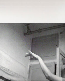
Evoking the situation of city dwellers who long to escape their tiny, cramped apartments, this work shows a hand mimicking the movements of a bird soaring in flight.

Friday 27 November 2009

LEGO LOVERS!!!

WOLF LOVES PORK

This morning Joni (flatmate) showed me the most amazing stop frame animation. damn i wish we did our video as such fun and painstaking way... the video is absolutely amazing!!!!


Going through David Ling's projects, It is significant that some features in his "home loft" has resembles to his projects.

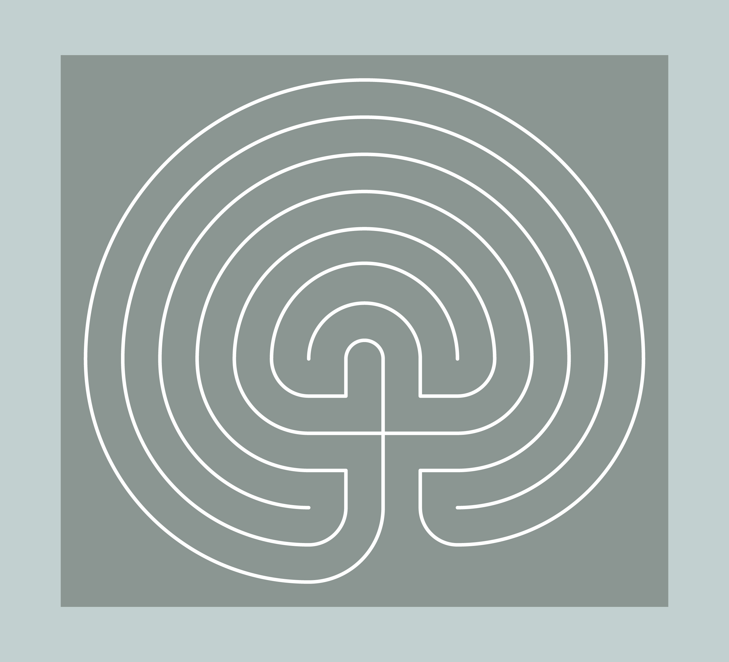
David Ling "Labyrinth"


The annual Art and Structure Exhibits, founded by artist Joan Sherman, involve collaboration between esteemed artists, architects and designers. These exhibits explore the boundaries that define their fields of expression, challenging the artificial separation of artistic pursuits. Each installation relates conceptually to the experience of people involved with The Family Center. Established in 1994, The Family Center is a non-profit organization providing legal and social services to parents who are seriously ill.

The theme of this year’s exhibit was “Light and Illusion.” The architects and designers participating in “Light and Illusion” created installations that investigate the ability of art to reveal truth or create illusion. Architect David Ling and sculptor Norman Mooney designed a luminous labyrinth of cast glass and rough-hewn stones representing the various paths families take in life. Fred Schwartz collaborated with Domingo Gonzalez to construct a canopy of cascading lights recalling tiny spring blossoms, symbolizing hope and renewal. Juergen Riehm and Bill Schwinghammer installed a massive, glowing box that appeared to defy gravity, connecting viewers with the tenuous nature of life. And Samuel Botero and Pablo Molgora included mothers and children of The Family Center in the creation of their piece.

The Architectural Uncanny

Anthony Vidler
"Not only is human being interpretation all the way down, so that our practices can never be grounded in human nature, God's will, or the structure of rationality, but this condition is one of such radical rootless that everyone feels fundamentally unsettled (unheimlich), that is, senses that human beings can never be at home in the world. this, according to Heidegger, is why we plunge into trying to make ourselves at home and secure. "

When i was a kid, i believe home is where you feel at ease. Home is where you 'return to' after school.

In 2002, along with my brother (2 yrs older) each hauling a jammed-packed suitcase. Flew across the sea to UK and studied at an boarding school. At that time home was across the sea in HK.
After a few years, I started referring the boarding house as "home" (parents were no pleased)
Did i say so because the contents in my room grew, have i simply "got used to the idea", is it my friends at school that made me feel at home?
(In the boarding house we would treat each other as sisters ; have fights, snuggle & watch tv, go shopping, have detention for makeup...etc)

At present times, refer every where home easily, my halls is home, my present address is home, my boyfriends place is home, my hk home is home...

Does it mean that we don't only have one "main" home. Home is where our loved one is, where our belongings are, and most of all where we feel accepted, relaxed and at ease.As we grow up the term in our idea about home changes along with the changes of our needs and demands.

Therefore home is where our mind think it is, even if you live in a rubbish pit, if you feel at home, your at home.

Thursday 26 November 2009

Stop Frame Animationa "Swing"


Combination of photos taken from Zoe,
Resizing photos using photoshop, black and white mask, brightness contrast
Combine with premier pro + Channel blur effect

Made for injecting into film as intervals effect etc....

City Illusion


Video Naree and I came up with last night, adding motion effects on different layers of images that we pre-photoshoped. Using Adobe Premier Pro.

This particular footage is made for projecting on the fabric screening for illusion effects, and also possible for using in the film...

This footage is of buildings manipulating and moving about because, the subject of our film is about schizophrenia, one of the possible symptom is illusions. And therefore this scene is about how the subject imagine the city collapsing and rotating around here.etc

Labyrinth


Almost in every book, article, artist, architect's research I have done, the word "labyrinth" always pop up. Some how in my mind a myth character with sharp pointed ears pop up every time.. some sort of a creature or idea of a creature... i have no idea why, that's why i've decided to do some research into it.

Wiki Explanation:
"Mazelike structure from Greek mythology"
In Greek mythology, the Labyrinth (Greek λαβύρινθος labyrinthos) was an elaborate structure designed and built by the legendary artificer Daedalus for King Minos of Crete at Knossos. Its function was to hold the Minotaur, a creature that was half man and half bull and was eventually killed by the Athenian hero Theseus. Daedalus had made the Labyrinth so cunningly that he himself could barely escape it after he built it.[1] Theseus was aided by Ariadne, who provided him with a skein of thread, literally the "clew", or "clue", so he could find his way out again.

Vertical Farms + Robotic Arms

Bostonian architecture firm Höweler + Yoon took a look at some of the stalled construction projects around town and decided to not only gussy them up, but make them useful as well. The solution? Eco-Pods, or algae garden capsules attached to the skeletal, halted construction projects.

Designed in cooperation with LA's Squared Design Lab, the capsule would be rotated and repositioned by robotic arms to maximize efficiency, and the end product would be biofuel. It's all a bit sci-fi, but — hey — it'd be sweet if it ever came to see the light of day.


As a female and individual, normally i would be all for these impractical useless psychotic designs. Although this time, I'm not too sure, first, simply use fuel to power these "handy arms" would itself cause polllution. Second, such large condensed space packed with plants, would attract lots of insects. In my mind machinery and plants+water+soil+insects, doesn't mix well, it could cause alot of accidents with the connection of the building ie mould growing on surfaces and the buildings might not fix together as well causing it to collapse... But the whole idea of bringing green into the city is overall good, but the idea of growing plants like buildings, creative but not so practical, it would be like Hundertwassers building . But i like Hundertwassers idea about man living underneath green more... and it is also more simple than this.

Aesthetically interesting though.

3 Meter-Cubed Space

Japanese architect Jo Nagasaka and the Schemata Architecture Office have come up with a home design that rethinks just how much space one person needs. 6,000 square feet? 600? Well, try 30 square feet.

The Paco home has a hammock to sleep on, a Japanese-style recessed desk, and a sink, toilet and shower all in a crate that's a 3-meter-cube. It's not intended to replace where you live now, but rather to supplement it. It could be a beach house, a portable office — anything, really, as long as you find a way to lug it into place and hook up the water. Trying to open that hatch-like roof to get in doesn't look like the most comfortable solution, either, though maybe that's a doggy door on the side.

Still, toss some posters on the wall, maybe put a rug down, and you've got yourself a happy little home. Check out the gallery below for more of the Paco house.


On the website there were alot of negative comments and feedback about this design;

It looks like a dumpster.....

Once again, there is no thought spared to those above six foot two hundred pounds. Not only do I have stress my back just to get in my car of the future, but my hamster cage of the future as well

As a whole abruptly, but how such thing in the plane to transport?
It seems to me it is a little bit left unfinished variant...

Although i actually quite like it, its like a transportable studio flat. The fact that every thing about this design is sooooo Japanese like.. "WABI SABI" simple, clean, sharp, hidden away. All essential about living is compacted in there toilet, shower, sleeping space, kitchen...etc. It almost seem like an blank canvas with the initial starts for you... like a coloring book... "here is the pattern/grid now decorate the way you want to".

They even solved the problem of air ventilation without breaking the perfect cube... by making the roof adjustable to open up like a cigarette box. Ingenious... Although i like the idea of such a simple house, I personally would never be able to live inside one, as i prefer cosy messy houses... houses with a history, with its on characters... nothing new... some where other people have once been and left their existence on the walls, floors..etc sounds stalker like but ... a place that has a scar that shows it was once loved by somebody else.


David Ling


David Ling
You know when i moved in, and made this leap of faith in 2000 and bought this place. And it is of over-whelming of volume, this huge building for me, at the time i was actually confronted by actually, what am i actually going to do with this place. It was actually a challenge because it meant its exposing your personality, because its almost an autobiographical spatial story, and there were tweaks, i froze the first winter because i didn't like the look of the radiators, after turning blue i decided to turn the radiators back. So its a kind of weird functional kind of compromises to straight to be able to live.


I enjoy the sort of live work aspect of it because its the kind of aspect i work any ways. because there isn't much separation from the way i live and the way i work. the way i see my life is through my design career, the people i meet and the friends i make. so i see this lift a kind of lab of sorts. its things i would do to myself that i would be hesitant to do to my client.


in this particular house which was a old dental factory built in the 1880, i wanted to keep the original shells as a raw as possible. i was educated in a Europe and had a lot of chances to see a lot of castles and medieval buildings in German and Italy. And was inspired by the rustication and rawness of the stone work.
I retained the masonry openings, god rid of windows and crammed glass, so you can see the guts of the building. The contrast overlay of old and new and the layering of history is in the ceiling area, where i have this sheet rock ceiling and 19th century exposed beams . i enjoy the layering of history and contrast.

I'm interested in juxtaposing 'wholer' differences in every really the materiality the rough versus the smooth, the cold versus the warm, curve versus straight. In the contrast and the tension between these opposites. I get a kick out of intervals that age and acquire. I freak out when there is a first crack of paint or the first paint peels off, but then it acquire a life of itself. and its kind of challenged to accept change and accident, love this space and i cant see myself moving out of it. i could evolve the space as my needs change. think a space should be able to do that. I still think this is pretty much home. i want to keep producing my work and say things that have never been said before in a timeless way.

Informed by a multi-cultural background, nurtured in the US, formed in Europe and with an umbilical cord still attached to china, David Ling founded David Ling Architects in 1992. After training as an associate with Richard Meler, I.m. Pei, and Emillo Ambasz, Ling established an international practice in the U.S., Europe and Asia. Composed of exhibition spaces, creative offices, high-end retail, high end residences and institutional spaces Ling's work has received numerous international awards such as the Interior Magazine's Future Furniture Awards and Kitchen and Bath Designer Leader Award, Municipal Arts Society's National Design Award, architectural Bienal Miami + Beach Gold and Silver medals, Benjamin Moore;s Hue Awards for Best Residential Interiors, London's Design Partnership Award for Best Retail Design and Best in Show ICFF and London's Grosvernor House Antiques Fair. Ling's international press includes the New York Tines, Interior Design, Interiors, House and Garden, Elle Decor, Metropolitan Home, Dwell Wallpaper, Arte, Dwell Video, Casa da Abitare, Interni, Architektur und Wohnen, Frankfuter....etc

Ling's Clients list includes Alberta Ferretti, Stece Wynn, Aaliyah, Blue Man Group, Sade's Band leader, Janet....etc

Ling has held teaching positions at Parson School of Design and University of Nuremburg and has served on design juries at Interiors Magazine, Harvard Graduate School of Design, Columbia University and the University of Pennsylvania.

The Essence of Ling's Architecture is the artistic intergration of space, form, light and function enriched by materiality. As all projects are treated as unique, so too is Ling's creative vocabulary, tailored to diverse clients, sites, budgets and programmes. Ling's approach is a sculpted choreography of opposites, forming a dialogue of interlocking spaces and forms articulated in a crafted use of materials, ennobling space and form through materiality and light.

David Ling's ultimate goal is to create something never said before, in a timeless manner.

Thursday 19 November 2009

Herzog & de Meuron


Herzog & de Meuron Architekten, BSA/SIA/ETH (HdeM) is a Swiss architecture firm, founded and headquartered in Basel, Switzerland in 1978. The careers of founders and senior partners Jacques Herzog (born 19 April 1950), and Pierre de Meuron (born 8 May 1950), closely paralleled one another, with both attending the Swiss Ferderal Institute of Technology(ETH) in Zürich. They are perhaps best known for their conversion of the giant Bank side Power Station in London to the new home of the Tate Britain. Jacques Herzog and Pierre de Meuron have been visiting professors at the Harvard University Graduate School of Design since 1994 and professors at ETH Zürich since 1999.

Herzog & de Meuron


Herzog & de Meuron - Elbephilharmonie, Hamburg (Copyright Herzog & de Meuron)

The Swiss Architects Herzog & de Meuron have proposed a new design for the Philharmonie in the HafenCity of Hamburg at the waterfront of the river Elbe - the Elbphilharmonie. On top of an old warehouse two concerthalls (a big one, and a smaller one) are positioned, plus a hotel that wraps around it all.

The form of the building echoes the water of the Elbe. The glass facade recalls the transparency of water.

The cone on the ceiling diverges the sound.

Tuesday 17 November 2009

Zaha Hadid-Phaeno science centre, Wolfsburg


Zaha Hadid

From The Sunday Times
March 9, 2008

Zaha Hadid: the Clerkenwell home of a superstar architect
One of the world’s most innovative architects, Zaha Hadid is far too busy to do up her London flat


You can’t help approaching the home of Zaha Hadid with excitement. This architectural superstar creates buildings that shoot off at extraordinary angles, defy gravity, take your breath away and win awards. What on earth will her own place be like? Will she have an “urban carpet”, with the ground slowly rising to form the back wall, as at the contemporary-art centre she masterminded in Cincinnati? Or enormous windows like veined leaves, as in her design for a concert venue in Abu Dhabi? Will the interior be kitted out with craters and subterranean caverns, like her Phaeno science centre, in Wolfsburg, Germany?

As you leave the lift at the top floor of an unprepossessing block in Clerkenwell, central London, the answers to those questions emerge as an Amy Winehouse-esque “no, no, no”. We are in a large, white, rectangular open-plan living room. It is a blank space, defined by common-or-garden right angles, that appears to have been designed by a navvy with a spirit level, rather than a genius who has won the Pritzker, the Nobel prize of architecture.

Hadid, 57, adamantly points out that this flat is not her own work. She moved here 2½ years ago, when she needed somewhere to live after a domestic emergency. She had been living in a flat in Kensington, west London, when it suddenly turned into a disaster zone. One Sunday night, when the globe-trotting architect was away in China, water gushed in from an upper-floor flat.

“I had a fountain from upstairs,” she recalls. “For a whole night, water was pouring in like a waterfall. It was a nightmare. I got back to find the whole place and my furniture damaged.” An attempt to fix the problem failed. “It started leaking again. That’s why I left that flat and moved here.”

Hadid wanted to be nearer to the office of her 28-year-old architectural practice, which is just around the corner.

Driving back and forth between Kensington and Clerkenwell all the time was too much,” she says. “It was 45 minutes each way.” She had looked at other flats in Clerkenwell, but they all needed work, and she wanted somewhere she could move into immediately. So she was pleased to find this ready-made minimalist top-floor flat, with about 2,500 sq ft of floor space. It cost “less than £2m, I think”.

It is a cloudy day, but light is flooding into the living room from a four-pane roof light. “One thing that’s nice about this flat is that it’s very bright, even on a dull day,” she says. “And there’s nobody above me to cause problems or make a noise.”

The place isn’t perfect, however, and when you have 40 other building projects under way, from an office tower in Dubai to an opera house in China, you can’t always find the time to complete your own home improvements. “I was supposed to renovate this place, but I haven’t,” she admits.

You would expect Hadid’s kitchen, at least, to be state-of-the-art. She recently worked with DuPont to create the Z Island, surely the most advanced kitchen design on the planet. It has two curvaceous Corian work stations offering everything a master chef could want and more – including light, music, the internet and “aromatic scent dispensers” that pump out appealing fragrances.

The Z Island is not in its creator’s home, though – at least, not yet. Instead, near the edge of the main living room stands a grotesque, blocky kitchen unit containing hobs and a sink. It was there when Hadid arrived.

“It was a mistake on my part not to demolish it straightaway. Of course, once you move in, it becomes more difficult.” There is also a tiny kitchen off the main room. “It’s more like a pantry. And it’s an impractical situation. I don’t cook here often, but if I do, and if I have something in the oven and something on the stove as well, one of them will burn.”

Hadid would also like a storage room, “for papers and whatnot”, and wants to bring her library of architectural books over from the office. So, she is considering a vertical extension: a new floor on the roof, to use as a bedroom or living room, thereby freeing up space below, and is in negotiations with the freeholder about this. If it goes ahead, she says the extension might employ the sinuous glass forms seen in the cable railway stations she designed at Inns-bruck, in the Austrian Alps, which opened last year to great acclaim. “I’d really like to do a project like that for myself. Or I could make it in fibreglass.”

The renovation plans are still fluid, and she is thinking out loud: “I think this flat is tame, compared with all the stuff we do in the office. I would like it wilder.” She dislikes the existing lighting – “Downlighting is not very attractive” – and says she could transform it with some chandeliers. She doesn’t mean old-fashioned crystal confections, but her Vortexx chandeliers, the curly fibreglass ribbons of light she designed in 2005 for the stylish home-furnishing company Sawaya & Moroni.

The flat contains some prime examples of Hadid’s own furniture designs, which are every bit as fluid and decon-structivist as her buildings, and sell for six-figure sums. There’s her Iceberg sofa, also for Sawaya & Moroni – it looks much more like an iceberg than any sofa I have ever seen. And there’s her Aqua table, for Established & Sons (run by Alasdhair Willis, husband of Stella McCartney), which has a translucent silica-gel surface and appears to stand on three inverted shark fins.

Curious smaller shapes clutter surfaces: architectural models, her collection of Murano glass and two shiny silver, Hadid-designed tea and coffee sets that double as interlocking table sculptures. The monotony of the white walls is relieved by five dramatic architectural paintings by Hadid herself. Throughout her career, sketching and painting have been key processes in the genesis of her designs.

No cushions, curtains or upholstery can be seen in the home of this chintz-phobic designer. “I don’t like soft furnishings. I can’t even sit on them,” she says, almost shuddering at the thought.

There are some tall, sculptural lilies in a vase in the living room, and, on the terrace, reached through a row of modern french windows, are planters nurturing a long screen of bamboo, but that’s it as far as botanical ornamentation is concerned. If she had more “plantation”, she would need people to water it, and she does enough delegating as it is: “It’s bad enough in the office.” Hadid lives alone, but it’s hard to imagine her being lonely for long, with her life a constant whirl of international collaboration and insatiable creativity.

Hadid likes to sit outside in summer, “but when the weather’s hot, it’s too hot there. I need a pool”. She would certainly be qualified to create a fine body of water: she is the architect of the London Aquatics Centre, a typically eye-catching creation to be used for the 2012 Olympic Games.

She has happy memories of growing up in Baghdad, in her parents’ 1930s house. “It had really beautiful 1950s Italian furniture,” she recalls. “My mother changed the furniture in the house all the time. She had a good eye. The dining room and my parents’ bedroom were art-deco rooms, almost Hollywood modern. My parents were interested in modernity. We used to get Life magazine at home, and I remember to this day seeing an image in Life of a modern building – it may have been in Chicago or New York.” It was, she says, one of the defining moments that turned her into an architect.

When she came to London in the early 1970s, to study at the Architectural Association, she lived on the King’s Road, “which a lot of people thought was very bourgeois. It was a friend’s flat, and I was paying £10 rent”. Later, she moved to “a really fabulous tiny house” in a mews off Gloucester Road. It was so small that furnishings required resourceful improvisation: “I did some great paintings there. I would do a painting, then I would turn it round and make it into a dining table.”

She has since turned her imagination to making extraordinary homes for other people. She has created a highly distinctive series of odd-angled flats over a protected viaduct by the Danube canal, in Austria, and her design for the 785ft Lilium Tower, in Warsaw, to be finished in 2012, will provide luxury low-energy flats and an apartment hotel.

“I’d like to do more houses,” she says. “That could be fun. I think it would be interesting to do some really state-of-the-art social housing. There haven’t been any radical ideas about affordable housing for a long time.”

Hadid likes Clerkenwell, enjoys its cosmopolitan air, but is sad that the Italian community, with its churches and Sunday-opening delis, is fast disappearing. From her flat, she often hears the sounds of frolicking children at a nearby primary school, but at the weekend, she says, it’s quiet: “It’s like being in a resort. I often have the feeling of being in a hotel somewhere else in the world.”

The thoughts of the world’s foremost female architect occasionally stray back to Kensington. She still owns that water-damaged flat. It is unoccupied, and there is unfinished business. “I want to fix it and decide what to do with it,” she sighs. “Apparently, the problem’s still there.”

Friday 13 November 2009

Andrei Tarkovsky Сталкер

Stalker; loosely based on their novel Roadside Picnic.
It depicts an expedition led by the Stalker (guide) Alexander Kaidanovsky to bring his two clients to a site known as "the Zone", which has the supposed potential to fulfill a person's innermost desires.

there is a tension between disbelief of the need for his elaborate precautions, and the possibility that they are necessary. The Stalker tests various routes by throwing metal nuts tied with strips of cloth ahead of him before walking into a new area. The Zone usually appears peaceful and harmless, with no visible dangers anywhere—Writer is skeptical that there is any real danger, while Professor generally follows the Stalker's advice.

The plot of the film seems interesting.. although 30 mins through the film i simply couldnt stand it any more...

Although there were a few scenes where i particularly liked the composition and angles